Follow these style guidelines to create beautiful, functional apps for TV.
Layouts
The difference between a TV experience that feels right and one that does not greatly depends on the number, spacing, and size of on-screen elements. Although TV sizes and resolutions have steadily increased over time, users expect TV experiences to be relatively simple and uncluttered.
The additional resolution and screen area afforded by modern displays is best used to display things at better quality, rather than greater quantity. For example, use your layouts to show large, beautiful pieces of content, or to resize type for both easy reading and generous spacing.
If you are creating an app for browsing and playing content, use the prebuilt fragments in the v17 leanback support library. These layouts have been built specifically for use on TV devices with the guidance of the Android User Experience team. For more information on using these classes, see the Building Apps for TV training.
Here are some additional recommendations for creating functional and attractive layouts for TV apps:
- Design layouts for landscape orientation. TV screens always use this orientation.
- Design your artwork assets for best viewing at HD resolution (1920 x 1080 pixels).
- Put on-screen navigational controls on the left or right side of the screen, and save the vertical space for content.
- Use fragments to create UIs that are divided into sections, and use view groups like Grid View instead of List View to make better use of the horizontal screen space.
- Avoid a cluttered interface by adding sufficient margins between layout controls.
Overscan
During the evolution of TV technology, overscan originally described an area of TV content outside of a safe zone that most TVs could reliably display. Even on some of today’s HDTV flat screens, areas outside that zone may not be visible.
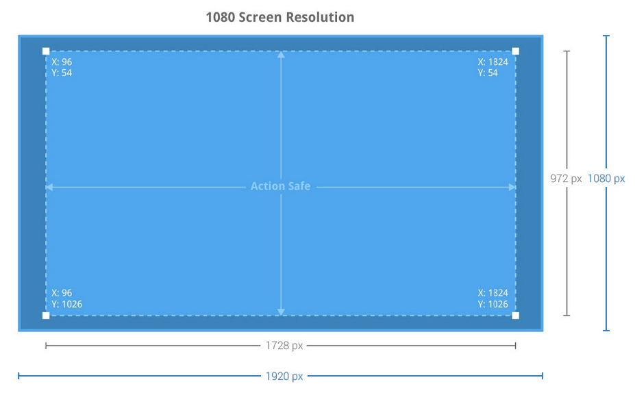
Build a 10% margin into your TV screen designs to account for overscan area the TV may not display correctly. On a 1920 x 1080 pixel screen, this margin should be a minimum of 27px from the top and bottom edges and a minimum of 48px from the right and left edges of the picture.
Color
Color rendering on televisions can be imprecise compared to computer monitors or mobile devices. LCD and Plasma TVs often apply smoothing and sharpening filters, and color rendering may not match what you see on a computer screen.
Subtle hue or brightness differences between elements may disappear or be over-emphasized on TV screens. Some color gradient combinations will show bands. You should avoid pure whites on large areas of the screen. For highly saturated colors (especially reds, greens and blues) you should review them when used to fill significant areas of the screen. You should also avoid using very dark or muddy colors, as TV settings may display these colors with exaggerated contrast, causing them to be indistinguishable.
Typography
The text and controls in a TV application's UI should be easily visible and navigable from a distance. The minimum recommended font size for TV is 12sp. The default text size setting should be 18sp. We recommend the following guidelines for TV apps:
- Card Titles: Roboto Condensed 16sp
- Card Subtext: Roboto Condensed 12sp
- Browse Screen Title: Roboto Regular 44sp
- Browse Category Title: Roboto Condensed 20sp
- Details Content Titles: Roboto Regular 34sp
- Details Subtext: Roboto Regular 14sp
Some TVs have strong sharpness and contrast settings as their defaults. These picture settings make thin and light typefaces look jagged and make the text difficult for people to read. Therefore you should avoid thin or light typefaces on TV.
Text
Use text in TV apps sparingly. The position of users relative to a TV screen (typically about 10 feet away) makes it harder for users to read text. Users also don't expect to read much in a TV environment. Follow these tips for the best handling of text in your app:
- Break text into small chunks that users can quickly scan.
- Use light text on a dark background. This style is easier to read on a TV.
- Avoid lightweight fonts or fonts that have both very narrow and very broad strokes. Use simple sans-serif fonts and anti-aliasing to increase readability.
- Use layout-relative sizing rather than absolute sizing, and density-independent pixel units instead of absolute pixel units.