These design principles provide some simple heuristics about how you should plan and assess your Android Wear app design.
Focus on not stopping the user and all else will follow

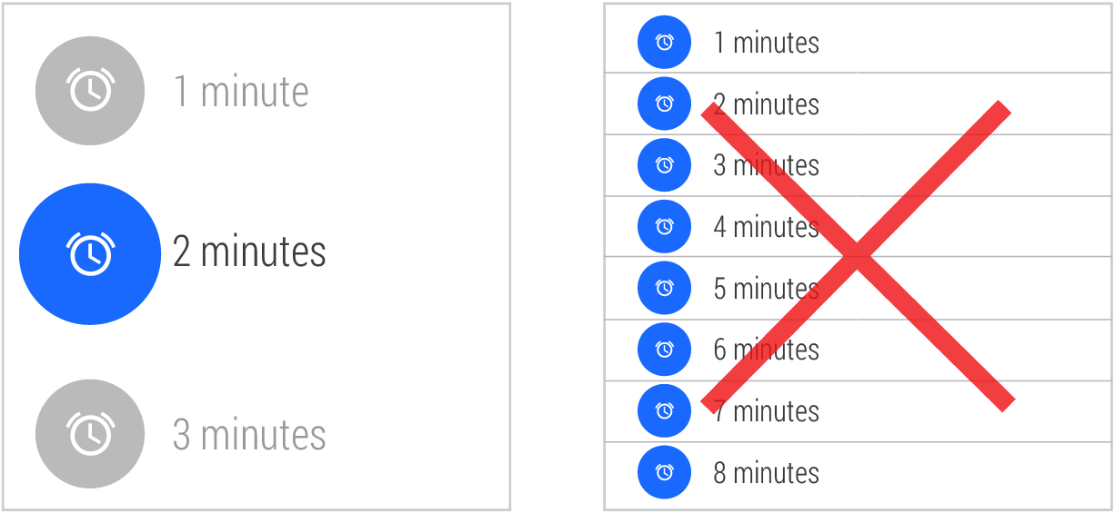
The time required for each action on the left is 5 seconds.
A watch is a perfect form factor for a device that you can use while doing something else, such as cooking, eating, walking, running, or even having a conversation. If using your wearable app causes the user to stop whatever they’re doing, it’s a good occasion to consider how to improve it using the principles in this section.
Try this: Time a typical use of your Wear app. If using it takes more than 5 seconds, you should think about making your app more focused. Also try using your app while you’re having a conversation, and see how it affects your train of thought and eye contact.
Design for big gestures
Use few and large touch targets.
When you swipe through photos on your phone, you’re using a large area of the display and precision isn't required. That’s the best kind of interaction for a wearable device. Your users are going to use your app in all sorts of situations, the least frequent one might actually be sitting down at their desk.
Try this: Use your app in various everyday situations, such as walking, eating, talking to people, or ordering coffee. If you have to slow down while walking or stop the conversation to be precise, you should consider how your gestures could be bigger.
Think about stream cards first
An app that offers to check in users could appear in the stream suggesting the most likely place nearby, after a certain amount of time.
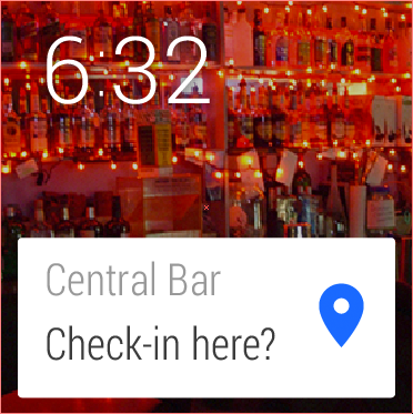
The best experience on a wearable device is when the right content is there just when the user needs it. You can figure out when to show your cards with sensors, or events happening in the cloud. For the cases where it’s impossible to know when the user needs your app, you can rely on a voice action or touch.
Try this: Make a list of all the situations a user would find your app useful. What do they have in common? Same location? Time of day? Certain physical activities? You will most likely come up with several different situations - that’s a good sign, because it means that you can specialize your cards to those situations. Remember that the user always has the option of completely muting your stream cards if they feel they aren’t relevant enough.
Do one thing, really fast
While users will engage with your app for only a few seconds at time, they'll use it many times throughout the day. A well-designed stream card carries one bit of information and potentially offers a few action buttons when the user swipes over.
Try this: How many bits of information are there in your design? Is everything absolutely necessary, or could you split it up into separate cards? If you’re designing a card, don’t forget that you can use multiple pages.
Design for the corner of the eye
The longer the user is looking at your app, the more you are pulling them out of the real world. Thinking about how to design your app for glanceability can vastly help the user get full value from your app and quickly go back to what they were doing.
Try this: To view your app with your peripheral vision, try focusing on your knuckles while your watch is displaying the app. Do you get a sense of what it is trying to do? Is it distinguishable from other apps? Does the background image help convey the message? Does it use photos or a distinct shape and color?
Don’t be a constant shoulder tapper
A watch constantly touches the user’s skin. Being this intimate, you want to vibrate the watch fewer times than you might on a phone.
Try this: Next time you’re in a conversation, imagine someone tapping you on your shoulder, interrupting you with the information you want your app to deliver. If the information delivered did not justify suspending a conversation, you should not make the notification interruptive.