 Developers
Users are used to tapping icons to launch apps. Android Wear is different. A typical Wear app adds a card to the stream at a contextually relevant moment. It might have a button that opens a full screen view for a fast micro interaction, but it just as well might not.
These are the building blocks, ordered by simplicity. You can use one of them or some of them, but we strongly recommend not building apps the user has to launch and quit before thinking really hard about how you could react to a specific location, activity, time of day, or something happening in the cloud.
- Contextual card in the stream:
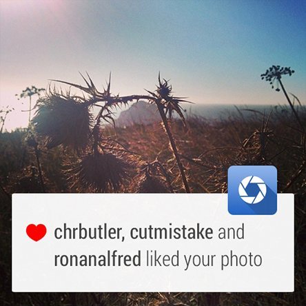
- Bridged notifications, such as new message notifications, are pushed to the wearable from the connected handheld using standard Android notifications. They require very little or no Wear-specific code.
- Contextual notifications, such as an exercise card that appears when you begin running, are generated locally on the wearable and appear at contextually relevant moments. You can do more with this kind of card than with a notification bridged from the handheld.
- Full screen UI app:
- 2D Picker is a design pattern that allows the user to select from a set of items, such as to select an artist then an album. We recommend using this pre-built component from the SDK whenever relevant.
- Custom layouts are also possible where apps need to extend beyond the basic card/stream metaphor, such as to present a graph or map.
- Keep your app always-on if you have information that refreshes or stays relevant, without draining the battery.
Bridged Notifications

This is the simplest way to get on Android Wear. In fact, your app already does this if it uses notifications. You can add Wear-specific features like extra pages and voice replies by using the new notification APIs.
Developer Docs
Creating a Notification
Contextual Notifications
This is what Android Wear does best: showing users information and functionality just when they need it.
Here’s how it works: Your app knows when it is relevant for the user. When the appropriate event occurs, the app triggers a notification. Maybe you’re building a running app that’s relevant when the user is running. Maybe it’s a museum guide that’s relevant when the user is visiting your museum. Check out the design principles for more about how to make your app contextual.
Getting contextual triggering right is one of the most impactful things you can do to craft a great user experience.
The easiest way to do this is to use standard templates for Android notifications. But you can also make your own layout from scratch with an activity inside a card. If you decide to do this, we strongly recommend you take a look at the Style guide to make sure you stay consistent with the rest of the device.
Developer Docs
Creating Custom Layouts
Don’t forget to test your triggering thoroughly. Triggering too often can be so annoying that users might end up blocking all your notifications.
2D Picker
The 2D Picker design pattern (available as the GridViewPager component) is useful for showing options in a list. Google search results are a great example of this pattern in action.
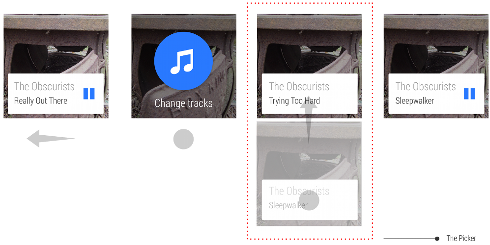
This pattern can be used to present a single vertical list, or a “1D Picker”
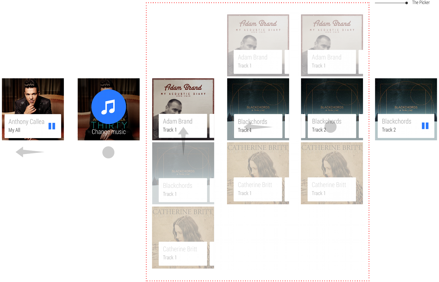
It can also be used as a 2D matrix of options, as a way of presenting categorized options.
Actions
Developer Docs
Creating a 2D Picker
For actions on each card, use the Action cards pattern.
Making it fast
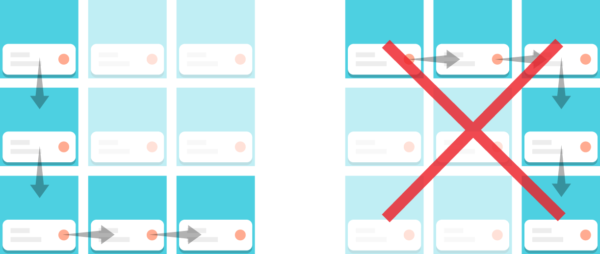
Navigation should be vertical-then-horizontal, not horizontal-then-vertical, and limit the the vertical set to about five cards.
Here are a few of our favorite tips about how to make the 2D picker really fast for your users:
- Minimize the number of cards
- Show the most popular card at the top
- Keep the cards extremely simple
- Optimize for speed over customization
Exiting
Your app should dismiss the 2D picker when the user makes a selection. Users should also be able to exit by swiping the first card down, or swiping left to right on a left-most card.
Breaking out of the card (with custom layouts)
Developer Docs
Creating Wearable Apps
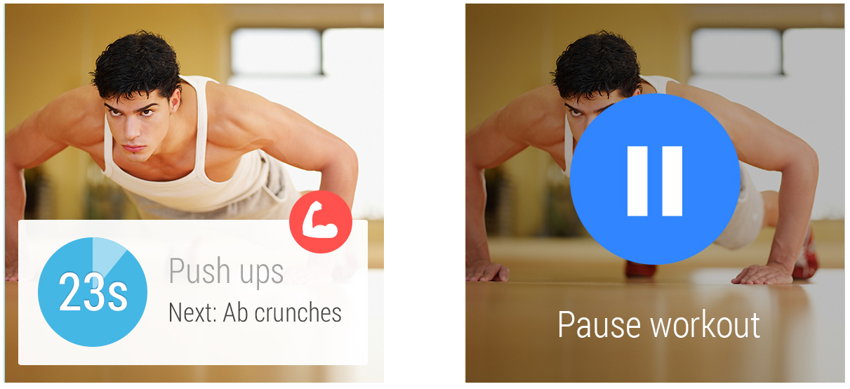
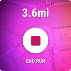
There are some things you can’t do on a card. Swiping in many directions on a map or controlling a game with a joystick are a couple examples. In those cases it might be good idea to momentarily go full screen.
A typical user experience with a full screen app on Android Wear looks like this:

- Your contextual card enters the stream.
- The user taps the card action.
- A full screen activity opens for a micro interaction.
- The activity quits and the user returns to the stream.
When to go full screen
We highly recommend going full screen only when you can’t do what you want on a card, and quickly exit back to the stream the moment the user is done with the micro interaction. This will make your app will feel like an integrated part of the system. Android Wear itself uses full screen for voice replies and the stopwatch.
Making it distinct
Your full screen design shouldn’t look too much like the card stream as it could confuse users. If you do need a card-like UI, the 2D picker is always available.
Automatically exiting
Many devices don’t have back or home buttons, so exiting is something you have to think about. Here are a few examples of natural ways to exit:
- A map that asks the user to drop a pin should exit when the pin is dropped.
- A short game can exit when the game finishes.
- A drawing app can finish after 5 seconds of inactivity.
An app generally should not exit in onPause(). This is because events such as Heads-up Notifications can trigger the onPause() callback.
Manually exiting
Even with logical exit points like these, some cases may exist where the user may want to
immediately exit. This may be common in apps that are used for a longer while. In all cases, you
should treat long-press as the user's intent to exit, using
DismissOverlayView.
Keeping the app always-on
Developer Docs
Keeping Your App Always-On
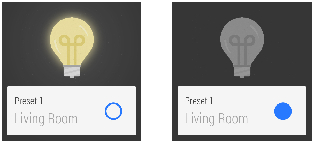
An Android Wear device has two modes:
- Interactive mode
- A full-color mode where the user can interact with your app.
- Ambient mode
- A low-power mode where the screen is rendered in black and white, with minimal grayscale graphics.
Interactive activities provide real-time information and feedback to the user, but it can quickly drain the device's battery. To reduce battery usage and still present useful information, apps can transition into an ambient mode called always-on.
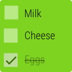
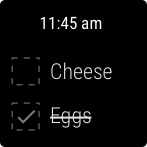
Your app can display dynamic data on the device, even when the app is in ambient mode. This approach is useful if your app displays information that is continuously updated, like a running tracker app, or when it presents information the user needs for reference, like a grocery app.
Typical user experiences with apps that switch into ambient mode on Android Wear look like this:

When the app switches to ambient mode, remove all elements that invite touch or indicate the elements are disabled. In addition, consider showing the current time.
Update frequency
You should only update the display once per minute, to preserve battery life of the wearable device. You can update the display every 10 seconds, but make sure you only update when absolutely necessary. Every update depletes the device's battery.
Interactive elements
Don’t present any buttons or other interactive elements when the app is in ambient mode. This approach could mislead the user into thinking the app is in interactive mode.
Colors and brightness
Use grayscale colors to help signal that the user must wake up the device before they can interact with it. Also note that any pixel that is not black will be noticeably bright for users in dimly lit rooms. We strongly recommend keeping the background black whenever possible.
Privacy
Consider the user’s privacy when designing and developing an app that displays data in ambient mode. For example, while keeping a messaging app on the screen could be convenient for a user who is in an ongoing conversation, displaying personal messages on the screen for an extended period of time while the app is in ambient mode may bother some users. Consider removing potentially private data after a short period of inactivity or refrain from showing sensitive data in ambient mode.