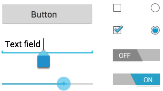
Input controls are the interactive components in your app's user interface. Android provides a wide variety of controls you can use in your UI, such as buttons, text fields, seek bars, checkboxes, zoom buttons, toggle buttons, and many more.
Adding an input control to your UI is as simple as adding an XML element to your XML layout. For example, here's a layout with a text field and button:
<?xml version="1.0" encoding="utf-8"?>
<LinearLayout xmlns:android="http://schemas.android.com/apk/res/android"
    android:layout_width="fill_parent"
    android:layout_height="fill_parent"
    android:orientation="horizontal">
    <EditText android:id="@+id/edit_message"
        android:layout_weight="1"
        android:layout_width="0dp"
        android:layout_height="wrap_content"
        android:hint="@string/edit_message" />
    <Button android:id="@+id/button_send"
        android:layout_width="wrap_content"
        android:layout_height="wrap_content"
        android:text="@string/button_send"
        android:onClick="sendMessage" />
</LinearLayout>
Each input control supports a specific set of input events so you can handle events such as when the user enters text or touches a button.
Common Controls
Here's a list of some common controls that you can use in your app. Follow the links to learn more about using each one.
Note: Android provides several more controls than are listed
here. Browse the android.widget package to discover more. If your app requires a
specific kind of input control, you can build your own custom components.
| Control Type | Description | Related Classes |
|---|---|---|
| Button | A push-button that can be pressed, or clicked, by the user to perform an action. | Button |
| Text field | An editable text field. You can use the AutoCompleteTextView widget to create a text entry widget that provides auto-complete suggestions |
EditText, AutoCompleteTextView |
| Checkbox | An on/off switch that can be toggled by the user. You should use checkboxes when presenting users with a group of selectable options that are not mutually exclusive. | CheckBox |
| Radio button | Similar to checkboxes, except that only one option can be selected in the group. | RadioGroup
RadioButton |
| Toggle button | An on/off button with a light indicator. | ToggleButton |
| Spinner | A drop-down list that allows users to select one value from a set. | Spinner |
| Pickers | A dialog for users to select a single value for a set by using up/down buttons or via a swipe gesture. Use a DatePickercode> widget to enter the values for the date (month, day, year) or a TimePicker widget to enter the values for a time (hour, minute, AM/PM), which will be formatted automatically for the user's locale. |
DatePicker, TimePicker |