 Developers
A text field allows the user to type text into your app. It can be either single line or multi-line. Touching a text field places the cursor and automatically displays the keyboard. In addition to typing, text fields allow for a variety of other activities, such as text selection (cut, copy, paste) and data look-up via auto-completion.
You can add a text field to you layout with the EditText object. You
should usually do so in your XML layout with a <EditText> element.
Specifying the Keyboard Type
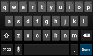
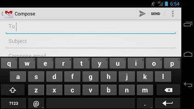
Figure 1. The default text input type.
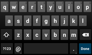
Figure 2. The textEmailAddress input type.
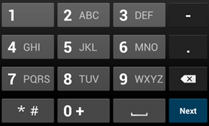
Figure 3. The phone input type.
Text fields can have different input types, such as number, date, password, or email address. The type determines what kind of characters are allowed inside the field, and may prompt the virtual keyboard to optimize its layout for frequently used characters.
You can specify the type of keyboard you want for your EditText object
with the android:inputType attribute. For example, if you want the user to input an email address, you
should use the textEmailAddress input type:
<EditText
    android:id="@+id/email_address"
    android:layout_width="fill_parent"
    android:layout_height="wrap_content"
    android:hint="@string/email_hint"
    android:inputType="textEmailAddress" />
There are several different input types available for different situations.
Here are some of the more common values for
android:inputType:
"text"- Normal text keyboard.
"textEmailAddress"- Normal text keyboard with the @ character.
"textUri"- Normal text keyboard with the / character.
"number"- Basic number keypad.
"phone"- Phone-style keypad.
Controlling other behaviors
The android:inputType also allows you to specify certain keyboard behaviors, such as whether to
capitalize all new words or use features like auto-complete and spelling suggestions.
The android:inputType attribute allows bitwise combinations so you can specify both a keyboard
layout and one or more behaviors at once.
Here are some of the common input type values that define keyboard behaviors:
"textCapSentences"- Normal text keyboard that capitalizes the first letter for each new sentence.
"textCapWords"- Normal text keyboard that capitalizes every word. Good for titles or person names.
"textAutoCorrect"- Normal text keyboard that corrects commonly misspelled words.
"textPassword"- Normal text keyboard, but the characters entered turn into dots.
"textMultiLine"- Normal text keyboard that allow users to input long strings of text that include line breaks (carriage returns).
For example, here's how you can collect a postal address, capitalize each word, and disable text suggestions:
<EditText
    android:id="@+id/postal_address"
    android:layout_width="fill_parent"
    android:layout_height="wrap_content"
    android:hint="@string/postal_address_hint"
    android:inputType="textPostalAddress|
                       textCapWords|
                       textNoSuggestions" />
All behaviors are also listed with the android:inputType documentation.
Specifying Keyboard Actions

Figure 4. If you declare android:imeOptions="actionSend", the keyboard includes the Send action.
In addition to changing the keyboard's input type, Android allows you to specify an action to be made when users have completed their input. The action specifies the button that appears in place of the carriage return key and the action to be made, such as "Search" or "Send."
You can specify the action by setting the android:imeOptions attribute. For example, here's how you can specify the Send action:
<EditText
    android:id="@+id/search"
    android:layout_width="fill_parent"
    android:layout_height="wrap_content"
    android:hint="@string/search_hint"
    android:inputType="text"
    android:imeOptions="actionSend" />
If you do not explicitly specify an input action then the system attempts to determine if there
are any subsequent android:focusable fields. If any focusable fields are found following this one, the system
applies the "actionNext" action to the current EditText so the user can
select Next to move to the next field. If there's no subsequent focusable field, the system applies
the "actionDone" action. You can override this by setting the android:imeOptions attribute to any other value such as "actionSend" or "actionSearch" or suppress the default behavior by using the "actionNone" action.
Responding to action button events
If you have specified a keyboard action for the input method using android:imeOptions attribute (such as "actionSend"), you can listen for the specific
action event using an TextView.OnEditorActionListener. The TextView.OnEditorActionListener interface provides a callback method called onEditorAction() that indicates the
action type invoked with an action ID such as IME_ACTION_SEND or IME_ACTION_SEARCH.
For example, here's how you can listen for when the user clicks the Send button on the keyboard:
EditText editText = (EditText) findViewById(R.id.search);
editText.setOnEditorActionListener(new OnEditorActionListener() {
    @Override
    public boolean onEditorAction(TextView v, int actionId, KeyEvent event) {
        boolean handled = false;
        if (actionId == EditorInfo.IME_ACTION_SEND) {
            sendMessage();
            handled = true;
        }
        return handled;
    }
});
Setting a custom action button label
If the keyboard is too large to reasonably share space with the underlying application (such as
when a handset device is in landscape orientation) then fullscreen ("extract mode") is triggered. In
this mode, a labeled action button is displayed next to the input. You can customize the text of
this button by setting the android:imeActionLabel attribute:
<EditText
    android:id="@+id/launch_codes"
    android:layout_width="fill_parent"
    android:layout_height="wrap_content"
    android:hint="@string/enter_launch_codes"
    android:inputType="number"
    android:imeActionLabel="@string/launch" />
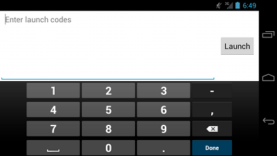
Figure 5. A custom action label with android:imeActionLabel.
Adding Other Keyboard Flags
In addition to the actions you can specify with the android:imeOptions attribute, you can add additional flags to specify other keyboard
behaviors. All available flags are listed along with the actions in the android:imeOptions documentation.
For example, figure 5 shows how the system enables a fullscreen text field when a handset device
is in landscape orientation (or the screen space is otherwise constrained for space). You can
disable the fullscreen input mode with flagNoExtractUi in the android:imeOptions attribute, as shown in figure 6.
Figure 6. The fullscreen text field ("extract mode") is
disabled with android:imeOptions="flagNoExtractUi".
Providing Auto-complete Suggestions
If you want to provide suggestions to users as they type, you can use a subclass of EditText called AutoCompleteTextView. To implement
auto-complete, you must specify an Adapter that provides the text
suggestions. There are several kinds of adapters available, depending on where the data is coming
from, such as from a database or an array.
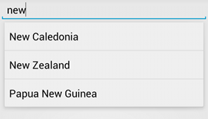
Figure 7. Example of AutoCompleteTextView with text suggestions.
The following procedure describes how to set up an AutoCompleteTextView
that provides suggestions from an array, using ArrayAdapter:
- Add the
AutoCompleteTextViewto your layout. Here's a layout with only the text field:<?xml version="1.0" encoding="utf-8"?> <AutoCompleteTextView xmlns:android="http://schemas.android.com/apk/res/android" android:id="@+id/autocomplete_country" android:layout_width="fill_parent" android:layout_height="wrap_content" /> - Define the array that contains all text suggestions. For example, here's an array of country
names that's defined in an XML resource file (
res/values/strings.xml):<?xml version="1.0" encoding="utf-8"?> <resources> <string-array name="countries_array"> <item>Afghanistan</item> <item>Albania</item> <item>Algeria</item> <item>American Samoa</item> <item>Andorra</item> <item>Angola</item> <item>Anguilla</item> <item>Antarctica</item> ... </string-array> </resources> - In your
ActivityorFragment, use the following code to specify the adapter that supplies the suggestions:// Get a reference to the AutoCompleteTextView in the layout AutoCompleteTextView textView = (AutoCompleteTextView) findViewById(R.id.autocomplete_country); // Get the string array String[] countries = getResources().getStringArray(R.array.countries_array); // Create the adapter and set it to the AutoCompleteTextView ArrayAdapter<String> adapter = new ArrayAdapter<String>(this, android.R.layout.simple_list_item_1, countries); textView.setAdapter(adapter);Here, a new
ArrayAdapteris initialized to bind each item in theCOUNTRIESstring array to aTextViewthat exists in thesimple_list_item_1layout (this is a layout provided by Android that provides a standard appearance for text in a list).Then assign the adapter to the
AutoCompleteTextViewby callingsetAdapter().