 Developers
This lesson teaches you to
You should also read
Cards present information to users with a consistent look and feel across different apps. This lesson shows you how to create cards in your Android Wear apps.
The Wearable UI Library provides implementations of cards specifically designed for wearable
devices. This library contains the
CardFrame
class, which wraps views inside a card-styled frame with a white background, rounded corners, and a
light-drop shadow. A
CardFrame
instance can only contain one direct child, usually a layout manager, to which
you can add other views to customize the content inside the card.
You can add cards to your app in two ways:
- Use or extend the
CardFragmentclass. - Add a card inside a
CardScrollViewinstance in your layout.
Note: This lesson shows you how to add cards to Android Wear activities. Android notifications on wearable devices are also displayed as cards. For more information, see Adding Wearable Features to Notifications.
Create a Card Fragment
The
CardFragment
class provides a default card layout with a title, a description, and an icon. Use this approach to
add cards to your app if the default card layout shown in figure 1 meets your needs.
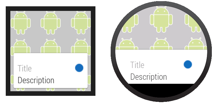
Figure 1. The default
CardFragment
layout.
To add a
CardFragment
instance to your app:
- In your layout, assign an ID to the element that contains the card
- Create a
CardFragmentinstance in your activity - Use the fragment manager to add the
CardFragmentinstance to its container
The following sample code shows the code for the screen display shown in figure 1:
<android.support.wearable.view.BoxInsetLayout
xmlns:android="http://schemas.android.com/apk/res/android"
xmlns:app="http://schemas.android.com/apk/res-auto"
android:background="@drawable/robot_background"
android:layout_height="match_parent"
android:layout_width="match_parent">

    <FrameLayout
        android:id="@+id/frame_layout"
        android:layout_width="match_parent"
        android:layout_height="match_parent"
        app:layout_box="bottom">

    </FrameLayout>
</android.support.wearable.view.BoxInsetLayout>
The following code adds the
CardFragment
instance to the activity in figure 1:
protected void onCreate(Bundle savedInstanceState) {
    super.onCreate(savedInstanceState);
    setContentView(R.layout.activity_wear_activity2);

    FragmentManager fragmentManager = getFragmentManager();
    FragmentTransaction fragmentTransaction = fragmentManager.beginTransaction();
    CardFragment cardFragment = CardFragment.create(getString(R.string.cftitle),
                                                    getString(R.string.cfdesc),
                                                    R.drawable.p);
    fragmentTransaction.add(R.id.frame_layout, cardFragment);
    fragmentTransaction.commit();
}
To create a card with a custom layout using the
CardFragment
class, extend the class and override its
onCreateContentView
method.
Add a CardFrame to Your Layout
You can also add a card directly to your layout definition, as shown in figure 2. Use this approach when you want to define a custom layout for the card inside a layout definition file.
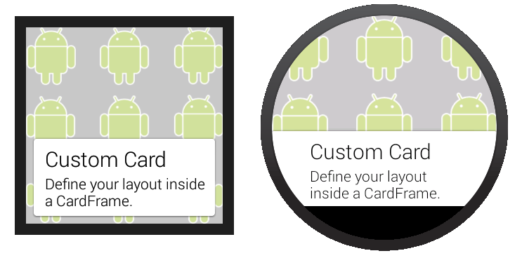
Figure 2. Adding a
CardFrame
to your layout.
The following layout code sample demonstrates a vertical linear layout with two elements. You can create more complex layouts to fit the needs of your app.
<android.support.wearable.view.BoxInsetLayout
xmlns:android="http://schemas.android.com/apk/res/android"
xmlns:app="http://schemas.android.com/apk/res-auto"
android:background="@drawable/robot_background"
android:layout_height="match_parent"
android:layout_width="match_parent">

    <android.support.wearable.view.CardScrollView
        android:id="@+id/card_scroll_view"
        android:layout_height="match_parent"
        android:layout_width="match_parent"
        app:layout_box="bottom">

        <android.support.wearable.view.CardFrame
            android:layout_height="wrap_content"
            android:layout_width="fill_parent">

            <LinearLayout
                android:layout_height="wrap_content"
                android:layout_width="match_parent"
                android:orientation="vertical"
                android:paddingLeft="5dp">
                <TextView
                    android:fontFamily="sans-serif-light"
                    android:layout_height="wrap_content"
                    android:layout_width="match_parent"
                    android:text="@string/custom_card"
                    android:textColor="@color/black"
                    android:textSize="20sp"/>
                <TextView
                    android:fontFamily="sans-serif-light"
                    android:layout_height="wrap_content"
                    android:layout_width="match_parent"
                    android:text="@string/description"
                    android:textColor="@color/black"
                    android:textSize="14sp"/>
            </LinearLayout>
        </android.support.wearable.view.CardFrame>
    </android.support.wearable.view.CardScrollView>
</android.support.wearable.view.BoxInsetLayout>
The
<CardScrollView>
element detects the shape of the screen and displays the card differently
on round and square devices, using wider side margins on round screens. However,
placing the
<CardScrollView>
element inside a
<BoxInsetLayout>
and using the layout_box="bottom" attribute is useful to align the card to the bottom
of round screens without cropping its content.