 Developers
This lesson teaches you to
- Customize Touch Feedback
- Use the Reveal Effect
- Customize Activity Transitions
- Animate View State Changes
- Animate Vector Drawables
You should also read
Animations in material design give users feedback on their actions and provide visual continuity as users interact with your app. The material theme provides some default animations for buttons and activity transitions, and Android 5.0 (API level 21) and above lets you customize these animations and create new ones:
- Touch feedback
- Circular Reveal
- Activity transitions
- Curved motion
- View state changes
Customize Touch Feedback
Touch feedback in material design provides an instantaneous visual confirmation at the
point of contact when users interact with UI elements. The default touch feedback animations
for buttons use the new RippleDrawable class, which transitions
between different states with a ripple effect.
In most cases, you should apply this functionality in your view XML by specifying the view background as:
?android:attr/selectableItemBackgroundfor a bounded ripple.?android:attr/selectableItemBackgroundBorderlessfor a ripple that extends beyond the view. It will be drawn upon, and bounded by, the nearest parent of the view with a non-null background.
Note: selectableItemBackgroundBorderless is a new
attribute introduced in API level 21.
Alternatively, you can define a RippleDrawable
as an XML resource using the ripple element.
You can assign a color to RippleDrawable objects. To change
the default touch feedback color, use the theme's android:colorControlHighlight
attribute.
For more information, see the API reference for the RippleDrawable class.
Use the Reveal Effect
Reveal animations provide users visual continuity when you show or hide a group of UI
elements. The ViewAnimationUtils.createCircularReveal() method enables you to animate a clipping circle to
reveal or hide a view.
To reveal a previously invisible view using this effect:
// previously invisible view
View myView = findViewById(R.id.my_view);

// get the center for the clipping circle
int cx = myView.getWidth() / 2;
int cy = myView.getHeight() / 2;

// get the final radius for the clipping circle
int finalRadius = Math.max(myView.getWidth(), myView.getHeight());

// create the animator for this view (the start radius is zero)
Animator anim =
    ViewAnimationUtils.createCircularReveal(myView, cx, cy, 0, finalRadius);

// make the view visible and start the animation
myView.setVisibility(View.VISIBLE);
anim.start();
To hide a previously visible view using this effect:
// previously visible view
final View myView = findViewById(R.id.my_view);

// get the center for the clipping circle
int cx = myView.getWidth() / 2;
int cy = myView.getHeight() / 2;

// get the initial radius for the clipping circle
int initialRadius = myView.getWidth();

// create the animation (the final radius is zero)
Animator anim =
    ViewAnimationUtils.createCircularReveal(myView, cx, cy, initialRadius, 0);

// make the view invisible when the animation is done
anim.addListener(new AnimatorListenerAdapter() {
    @Override
    public void onAnimationEnd(Animator animation) {
        super.onAnimationEnd(animation);
        myView.setVisibility(View.INVISIBLE);
    }
});

// start the animation
anim.start();
Customize Activity Transitions
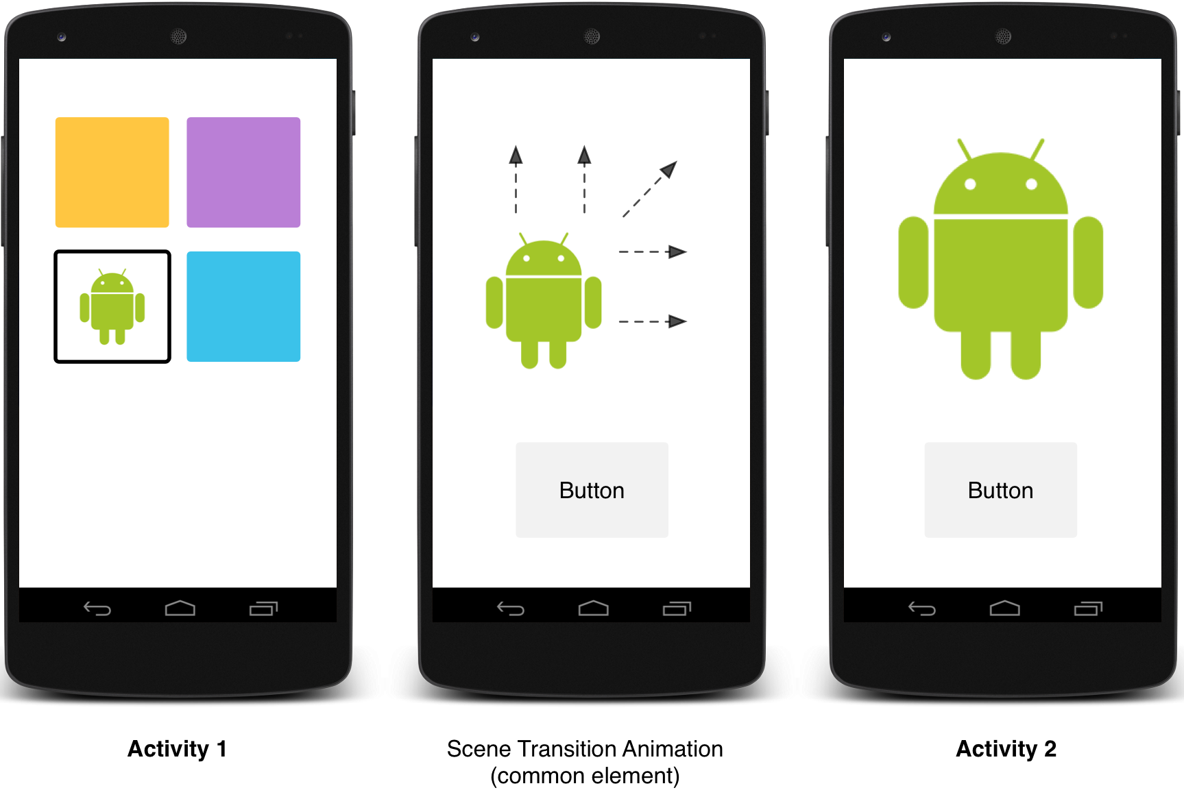
Figure 1 - A transition with shared elements.
To replay the movie, click on the device screenActivity transitions in material design apps provide visual connections between different states through motion and transformations between common elements. You can specify custom animations for enter and exit transitions and for transitions of shared elements between activities.
- An enter transition determines how views in an activity enter the scene. For example, in the explode enter transition, the views enter the scene from the outside and fly in towards the center of the screen.
- An exit transition determines how views in an activity exit the scene. For example, in the explode exit transition, the views exit the scene away from the center.
- A shared elements transition determines how views that are shared between two activities transition between these activities. For example, if two activities have the same image in different positions and sizes, the changeImageTransform shared element transition translates and scales the image smoothly between these activities.
Android 5.0 (API level 21) supports these enter and exit transitions:
- explode - Moves views in or out from the center of the scene.
- slide - Moves views in or out from one of the edges of the scene.
- fade - Adds or removes a view from the scene by changing its opacity.
Any transition that extends the Visibility class is supported
as an enter or exit transition. For more information, see the API reference for the
Transition class.
Android 5.0 (API level 21) also supports these shared elements transitions:
- changeBounds - Animates the changes in layout bounds of target views.
- changeClipBounds - Animates the changes in clip bounds of target views.
- changeTransform - Animates the changes in scale and rotation of target views.
- changeImageTransform - Animates changes in size and scale of target images.
When you enable activity transitions in your app, the default cross-fading transition is activated between the entering and exiting activities.
Figure 2 - A scene transition with one shared element.
Specify custom transitions
First, enable window content transitions with the android:windowContentTransitions
attribute when you define a style that inherits from the material theme. You can also specify
enter, exit, and shared element transitions in your style definition:
<style name="BaseAppTheme" parent="android:Theme.Material">
  <!-- enable window content transitions -->
  <item name="android:windowContentTransitions">true</item>

  <!-- specify enter and exit transitions -->
  <item name="android:windowEnterTransition">@transition/explode</item>
  <item name="android:windowExitTransition">@transition/explode</item>

  <!-- specify shared element transitions -->
  <item name="android:windowSharedElementEnterTransition">
    @transition/change_image_transform</item>
  <item name="android:windowSharedElementExitTransition">
    @transition/change_image_transform</item>
</style>
The change_image_transform transition in this example is defined as follows:
<!-- res/transition/change_image_transform.xml -->
<!-- (see also Shared Transitions below) -->
<transitionSet xmlns:android="http://schemas.android.com/apk/res/android">
  <changeImageTransform/>
</transitionSet>
The changeImageTransform element corresponds to the
ChangeImageTransform class. For more information, see the API
reference for Transition.
To enable window content transitions in your code instead, call the
Window.requestFeature() method:
// inside your activity (if you did not enable transitions in your theme)
getWindow().requestFeature(Window.FEATURE_CONTENT_TRANSITIONS);

// set an exit transition
getWindow().setExitTransition(new Explode());
To specify transitions in your code, call these methods with a Transition object:
Window.setEnterTransition()Window.setExitTransition()Window.setSharedElementEnterTransition()Window.setSharedElementExitTransition()
The setExitTransition() and setSharedElementExitTransition() methods define
the exit transition for the calling activity. The setEnterTransition() and setSharedElementEnterTransition() methods define the enter transition for the called activity.
To get the full effect of a transition, you must enable window content transitions on both the calling and called activities. Otherwise, the calling activity will start the exit transition, but then you'll see a window transition (like scale or fade).
To start an enter transition as soon as possible, use the
Window.setAllowEnterTransitionOverlap()
method on the called activity. This lets you have more dramatic enter transitions.
Start an activity using transitions
If you enable transitions and set an exit transition for an activity, the transition is activated when you launch another activity as follows:
startActivity(intent,
              ActivityOptions.makeSceneTransitionAnimation(this).toBundle());
If you have set an enter transition for the second activity, the transition is also activated
when the activity starts. To disable transitions when you start another activity, provide
a null options bundle.
Start an activity with a shared element
To make a screen transition animation between two activities that have a shared element:
- Enable window content transitions in your theme.
- Specify a shared elements transition in your style.
- Define your transition as an XML resource.
- Assign a common name to the shared elements in both layouts with the
android:transitionNameattribute. - Use the
ActivityOptions.makeSceneTransitionAnimation()method.
// get the element that receives the click event
final View imgContainerView = findViewById(R.id.img_container);

// get the common element for the transition in this activity
final View androidRobotView = findViewById(R.id.image_small);

// define a click listener
imgContainerView.setOnClickListener(new View.OnClickListener() {
    @Override
    public void onClick(View view) {
        Intent intent = new Intent(this, Activity2.class);
        // create the transition animation - the images in the layouts
        // of both activities are defined with android:transitionName="robot"
        ActivityOptions options = ActivityOptions
            .makeSceneTransitionAnimation(this, androidRobotView, "robot");
        // start the new activity
        startActivity(intent, options.toBundle());
    }
});
For shared dynamic views that you generate in your code, use the
View.setTransitionName() method to specify a common
element name in both activities.
To reverse the scene transition animation when you finish the second activity, call the
Activity.finishAfterTransition()
method instead of Activity.finish().
Start an activity with multiple shared elements
To make a scene transition animation between two activities that have more than one shared
element, define the shared elements in both layouts with the android:transitionName
attribute (or use the View.setTransitionName() method
in both activities), and create an ActivityOptions object as follows:
ActivityOptions options = ActivityOptions.makeSceneTransitionAnimation(this,
        Pair.create(view1, "agreedName1"),
        Pair.create(view2, "agreedName2"));
Use Curved Motion
Animations in material design rely on curves for time interpolation and spatial movement patterns. With Android 5.0 (API level 21) and above, you can define custom timing curves and curved motion patterns for animations.
The PathInterpolator class is a new interpolator based on a
Bézier curve or a Path object. This interpolator specifies a motion curve
in a 1x1 square, with anchor points at (0,0) and (1,1) and control points as specified using the
constructor arguments. You can also define a path interpolator as an XML resource:
<pathInterpolator xmlns:android="http://schemas.android.com/apk/res/android"
    android:controlX1="0.4"
    android:controlY1="0"
    android:controlX2="1"
    android:controlY2="1"/>
The system provides XML resources for the three basic curves in the material design specification:
@interpolator/fast_out_linear_in.xml@interpolator/fast_out_slow_in.xml@interpolator/linear_out_slow_in.xml
You can pass a PathInterpolator object to the Animator.setInterpolator() method.
The ObjectAnimator class has new constructors that enable you to animate
coordinates along a path using two or more properties at once. For example, the following animator
uses a Path object to animate the X and Y properties of a view:
ObjectAnimator mAnimator;
mAnimator = ObjectAnimator.ofFloat(view, View.X, View.Y, path);
...
mAnimator.start();
Animate View State Changes
The StateListAnimator class lets you define animators that run when
the state of a view changes. The following example shows how to define an StateListAnimator as an XML resource:
<!-- animate the translationZ property of a view when pressed -->
<selector xmlns:android="http://schemas.android.com/apk/res/android">
  <item android:state_pressed="true">
    <set>
      <objectAnimator android:propertyName="translationZ"
        android:duration="@android:integer/config_shortAnimTime"
        android:valueTo="2dp"
        android:valueType="floatType"/>
        <!-- you could have other objectAnimator elements
             here for "x" and "y", or other properties -->
    </set>
  </item>
  <item android:state_enabled="true"
    android:state_pressed="false"
    android:state_focused="true">
    <set>
      <objectAnimator android:propertyName="translationZ"
        android:duration="100"
        android:valueTo="0"
        android:valueType="floatType"/>
    </set>
  </item>
</selector>
To attach custom view state animations to a view, define an animator using the
selector element in an XML resource file as in this example, and assign it to your
view with the android:stateListAnimator attribute. To assign a state list animator
to a view in your code, use the AnimationInflater.loadStateListAnimator() method, and assign the animator to your view with the
View.setStateListAnimator() method.
When your theme extends the material theme, buttons have a Z animation by default. To avoid this
behavior in your buttons, set the android:stateListAnimator attribute to
@null.
The AnimatedStateListDrawable class lets you create drawables
that show animations between state changes of the associated view. Some of the system widgets in
Android 5.0 use these animations by default. The following example shows how
to define an AnimatedStateListDrawable as an XML resource:
<!-- res/drawable/myanimstatedrawable.xml -->
<animated-selector
    xmlns:android="http://schemas.android.com/apk/res/android">

    <!-- provide a different drawable for each state-->
    <item android:id="@+id/pressed" android:drawable="@drawable/drawableP"
        android:state_pressed="true"/>
    <item android:id="@+id/focused" android:drawable="@drawable/drawableF"
        android:state_focused="true"/>
    <item android:id="@id/default"
        android:drawable="@drawable/drawableD"/>

    <!-- specify a transition -->
    <transition android:fromId="@+id/default" android:toId="@+id/pressed">
        <animation-list>
            <item android:duration="15" android:drawable="@drawable/dt1"/>
            <item android:duration="15" android:drawable="@drawable/dt2"/>
            ...
        </animation-list>
    </transition>
    ...
</animated-selector>
Animate Vector Drawables
Vector Drawables are
scalable without losing definition. The AnimatedVectorDrawable
class lets you animate the properties of a vector drawable.
You normally define animated vector drawables in three XML files:
- A vector drawable with the
<vector>element inres/drawable/ - An animated vector drawable with the
<animated-vector>element inres/drawable/ - One or more object animators with the
<objectAnimator>element inres/anim/
Animated vector drawables can animate the attributes of the <group> and
<path> elements. The <group> elements defines a set of
paths or subgroups, and the <path> element defines paths to be drawn.
When you define a vector drawable that you want to animate, use the android:name
attribute to assign a unique name to groups and paths, so you can refer to them from your animator
definitions. For example:
<!-- res/drawable/vectordrawable.xml -->
<vector xmlns:android="http://schemas.android.com/apk/res/android"
    android:height="64dp"
    android:width="64dp"
    android:viewportHeight="600"
    android:viewportWidth="600">
    <group
        android:name="rotationGroup"
        android:pivotX="300.0"
        android:pivotY="300.0"
        android:rotation="45.0" >
        <path
            android:name="v"
            android:fillColor="#000000"
            android:pathData="M300,70 l 0,-70 70,70 0,0 -70,70z" />
    </group>
</vector>
The animated vector drawable definition refers to the groups and paths in the vector drawable by their names:
<!-- res/drawable/animvectordrawable.xml -->
<animated-vector xmlns:android="http://schemas.android.com/apk/res/android"
  android:drawable="@drawable/vectordrawable" >
    <target
        android:name="rotationGroup"
        android:animation="@anim/rotation" />
    <target
        android:name="v"
        android:animation="@anim/path_morph" />
</animated-vector>
The animation definitions represent ObjectAnimator or AnimatorSet objects. The first animator in this example rotates the target
group 360 degrees:
<!-- res/anim/rotation.xml -->
<objectAnimator
    android:duration="6000"
    android:propertyName="rotation"
    android:valueFrom="0"
    android:valueTo="360" />
The second animator in this example morphs the vector drawable's path from one shape to another. Both paths must be compatible for morphing: they must have the same number of commands and the same number of parameters for each command.
<!-- res/anim/path_morph.xml -->
<set xmlns:android="http://schemas.android.com/apk/res/android">
    <objectAnimator
        android:duration="3000"
        android:propertyName="pathData"
        android:valueFrom="M300,70 l 0,-70 70,70 0,0   -70,70z"
        android:valueTo="M300,70 l 0,-70 70,0  0,140 -70,0 z"
        android:valueType="pathType" />
</set>
For more information, see the API reference for AnimatedVectorDrawable.